August 15, 2022
A New Look for Red Letter
For the past four decades, Red Letter Communications has helped durable goods, healthcare, telecommunications, outdoor power equipment, and business-to-business brands stay relentlessly relevant.
No different from the organizations we help, our agency’s own brand must relentlessly pursue relevance. The Red Letter brand is evolving as the world changes, technology advances, and the agency continues to grow.
We set out to develop new branding that would visually communicate the agency’s growth and evolution – as well as our staff’s ability to stay nimble and true to our shared relentless nature that knows no bounds.

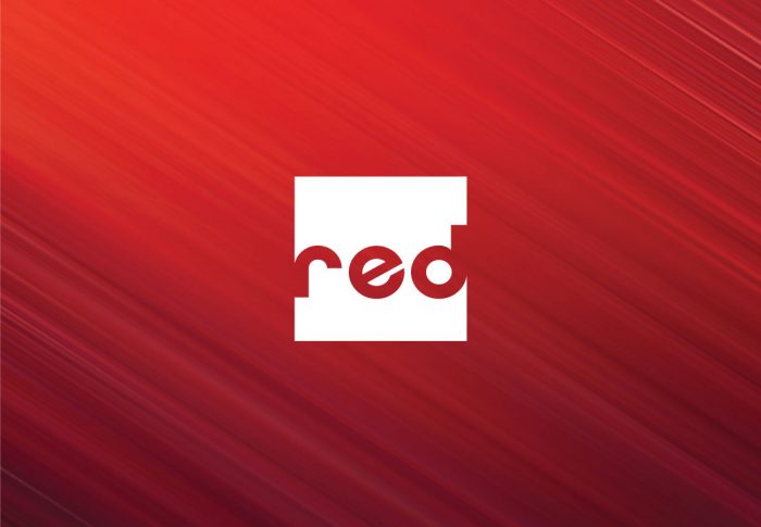
The new typography is modern and bold, yet more approachable with rounded letter shapes. The slightly tilted “e” helps the logo feel more playful and accessible. The word mark “red” stretches past the edges of the box shape to create a unique and distinctive mark through the use of negative space. Conceptually, the idea of pushing the type past the confines of the box encapsulates our agency’s ability to innovate, push boundaries, and go above and beyond our clients’ expectations.
Our new logo has the ability to flex and evolve for different circumstances, spaces, or moments in time. The basic shape and structure of the logo will always remain intact, but what fills the box can be customized – representing who we are, who we work with, where we work, how we work, and what we work on. Our new branding allows us to celebrate our team members and display our shared and distinct convictions.
After 40+ years in business, we remain determined to fulfill our agency’s mission of relentless relevance through the unique talents, skills, and diversity of our team. Red Letter’s new brand reinforces our commitment to our staff, clients, and community.
